
2022

Design System
Design Strategy
Icon Library
Samsung Iconography Principle
Explore how iconography principles were created for Samsung — establishing a unified visual language across multiple platforms and OS.
TL;DR
TL;DR
Defined the iconography principles behind Samsung's One UI 4 design system, creating over 3,300 icons used across Android, Windows, and Tizen for a more consistent, scalable, and user-centered visual language.
Responsible for
Sole designer of 3,300+ icons for Samsung system apps and cross-platform use (Android, Windows, Tizen)
Established icon usage principles based on user intent, UI context, and platform constraints
Led user research with 80 participants in Korea and the U.S. through focus group interviews
Tools used
Sketch
Adobe Illustrator
Problem
Problem
Samsung's icon system lacked unified usage rules—resulting in visual inconsistency and unclear UI communication across apps.
Until One UI 3, Samsung's design system defined the visual style of individual icons but lacked guidance on how to apply them consistently within UI contexts. This led to misbalanced icon placement across default apps, weakening visual hierarchy and reducing clarity. As part of the UX refinement for One UI 4, there was a need to establish clear, cross-platform iconography principles to ensure consistency, improve user comprehension, and enhance overall visual harmony.

Design Process
Design Process
A scalable iconography system was built through cross-market user research, design strategy, and iterative validation.
Starting with a design audit, I analyzed Samsung’s default apps and identified icon usage patterns. I then defined hypotheses and a design strategy to guide consistent icon application across One UI screens.
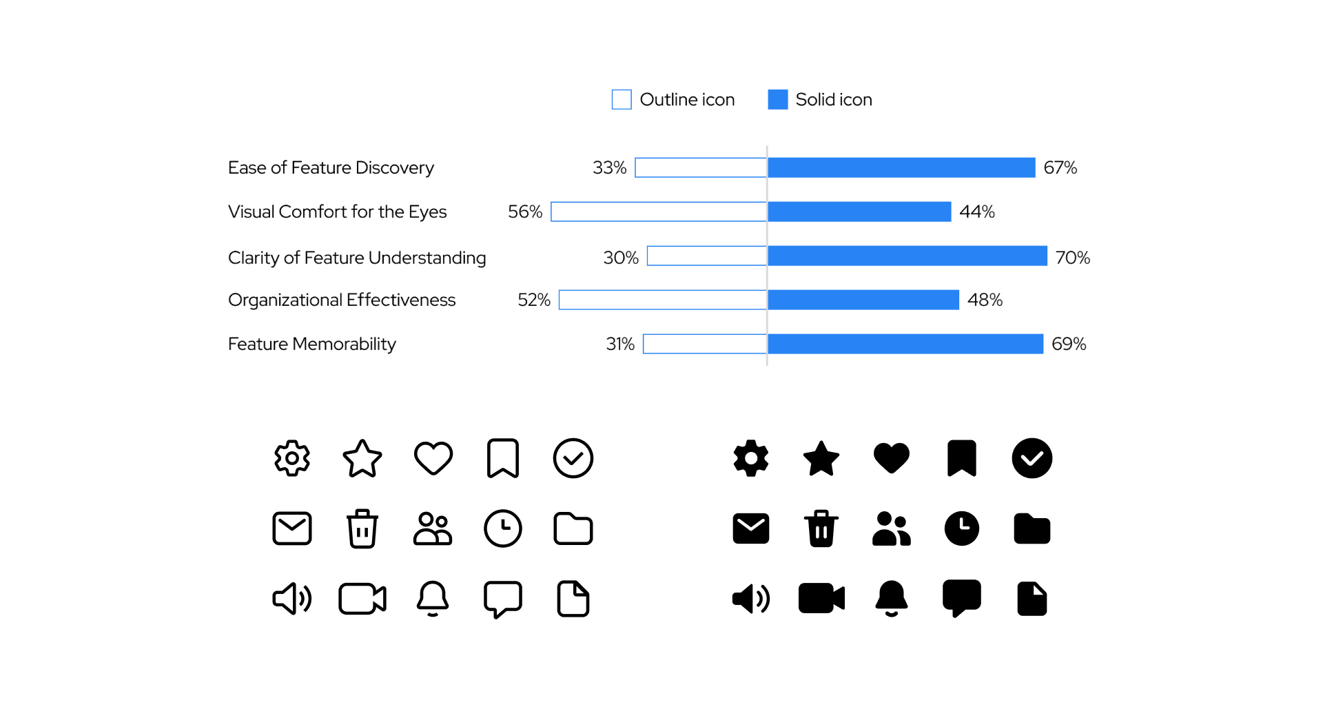
To validate these directions, I led focus group interviews with 80 users in the U.S. and Korea. The research revealed key behavioral insights—for example, outline icons improved readability in menu-heavy UIs, while solid icons were more effective in icon-only buttons or when emphasizing key features.
Using these insights, I developed clear design principles that defined when to use outline versus solid icons, ensuring clarity and consistency across diverse use cases. I applied these rules to redesign over 3,300 icons implemented across Android, Windows, and Tizen. Close collaboration with system designers and engineers ensured seamless integration leading up to the One UI 4 beta release.
Final Design
Final Design
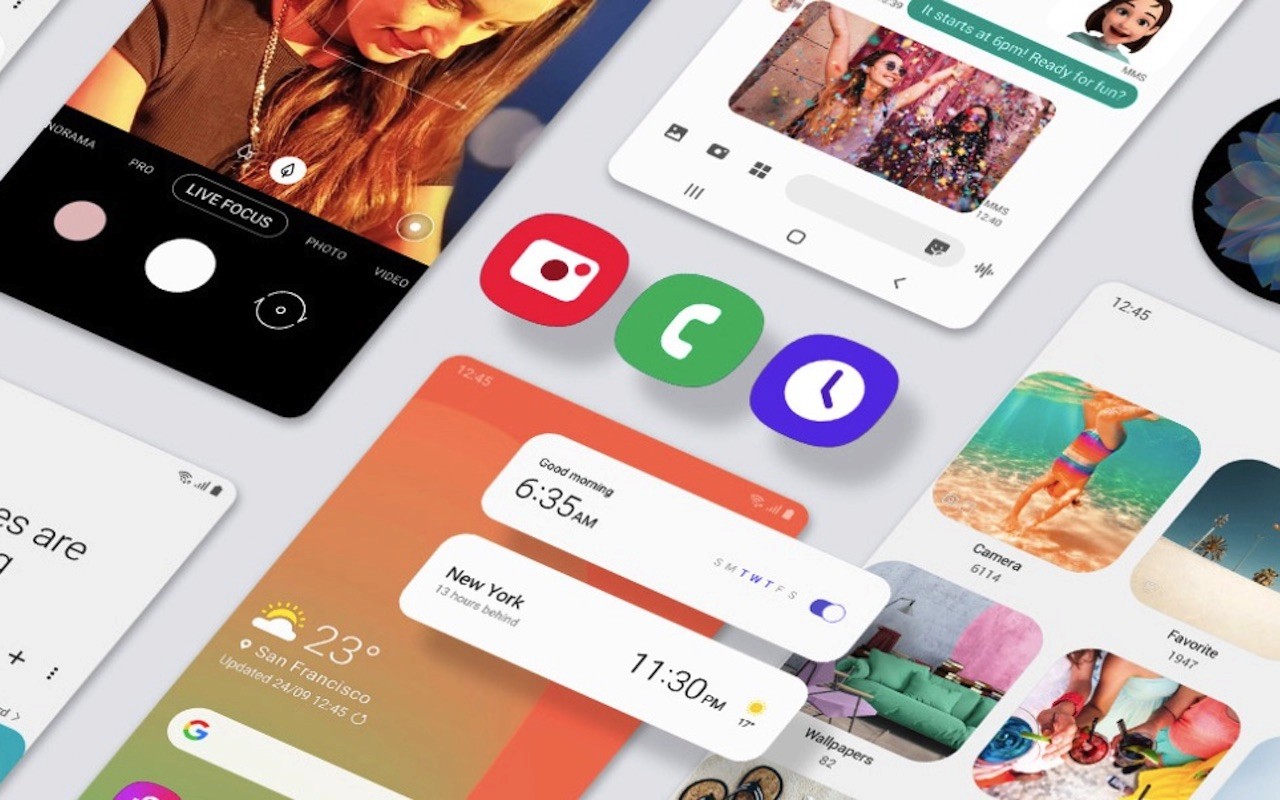
Principle-driven iconography brought visual harmony to One UI 4—spanning 3,300+ icons across Android, Windows, and Tizen.
The new iconography system introduced clear rules for when to use outline vs. solid icons, based on user intent, screen density, and visual hierarchy. Outline icons were used as the default style to support readability and reduce visual noise, while solid icons were applied selectively to guide focus and enhance icon-only actions. These principles were applied to redesign over 3,300 icons across system apps and platforms.
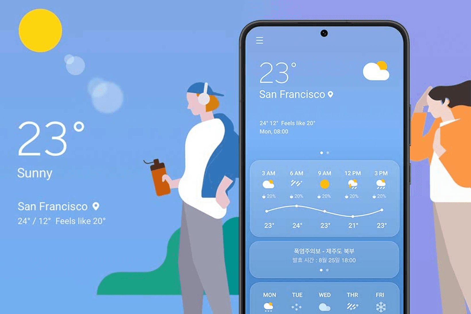
The Samsung Weather app was also fully redesigned, incorporating playful visuals that aligned with the updated One UI language. I designed a new set of weather icons as part of this effort.
Both the system-wide icon set and the weather visuals launched with One UI 4 and are now active on hundreds of millions of Galaxy devices.
Impact
Impact

Over 3,300 icons and a unified design principle are now implemented across Android, Windows, and Tizen on hundreds of millions of Galaxy devices.
The redesigned Samsung Weather app received enthusiastic user feedback and media praise for its playful visual identity.
Lesson learned
Lesson learned
This project deepened my expertise in systems thinking, cross-platform design, and turning research insights into visual consistency at scale.
Designing Principles that Scale Across Ecosystems
Establishing iconography rules for Android, Windows, and Tizen taught me how to think beyond simple visual consistency and focus on contextual contrast. I learned how well-defined visual structures reinforce brand clarity, improve usability, and create a more unified design system.
Turning Research into Actionable Visual Strategy
Leading focus group interviews across the U.S. and Korea helped me translate nuanced user behavior into precise, system-level design rules. This experience reinforced how qualitative insights can drive smarter design decisions—even at the micro level of icon shape and weight
Interested in the full story?
I'd love to share more behind-the-scenes insights - feel free to reach out for a deeper dive.
More Works
(NY® — 02)
©2024
More Works
(NY® — 02)
©2024


2022
Design System
Design Strategy
Icon Library
Samsung Iconography Principle
Explore how iconography principles were created for Samsung — establishing a unified visual language across multiple platforms and OS.
TL;DR
Defined the iconography principles behind Samsung's One UI 4 design system, creating over 3,300 icons used across Android, Windows, and Tizen for a more consistent, scalable, and user-centered visual language.
Responsible for
Sole designer of 3,300+ icons for Samsung system apps and cross-platform use (Android, Windows, Tizen)
Established icon usage principles based on user intent, UI context, and platform constraints
Led user research with 80 participants in Korea and the U.S. through focus group interviews
Tools used
Sketch
Adobe Illustrator
Problem
Samsung's icon system lacked unified usage rules—resulting in visual inconsistency and unclear UI communication across apps.
Until One UI 3, Samsung's design system defined the visual style of individual icons but lacked guidance on how to apply them consistently within UI contexts. This led to misbalanced icon placement across default apps, weakening visual hierarchy and reducing clarity. As part of the UX refinement for One UI 4, there was a need to establish clear, cross-platform iconography principles to ensure consistency, improve user comprehension, and enhance overall visual harmony.
Design Process
A scalable iconography system was built through cross-market user research, design strategy, and iterative validation.
Starting with a design audit, I analyzed Samsung’s default apps and identified icon usage patterns. I then defined hypotheses and a design strategy to guide consistent icon application across One UI screens.
To validate these directions, I led focus group interviews with 80 users in the U.S. and Korea. The research revealed key behavioral insights—for example, outline icons improved readability in menu-heavy UIs, while solid icons were more effective in icon-only buttons or when emphasizing key features.
Using these insights, I developed clear design principles that defined when to use outline versus solid icons, ensuring clarity and consistency across diverse use cases. I applied these rules to redesign over 3,300 icons implemented across Android, Windows, and Tizen. Close collaboration with system designers and engineers ensured seamless integration leading up to the One UI 4 beta release.
Final Design
Principle-driven iconography brought visual harmony to One UI 4—spanning 3,300+ icons across Android, Windows, and Tizen.
The new iconography system introduced clear rules for when to use outline vs. solid icons, based on user intent, screen density, and visual hierarchy. Outline icons were used as the default style to support readability and reduce visual noise, while solid icons were applied selectively to guide focus and enhance icon-only actions. These principles were applied to redesign over 3,300 icons across system apps and platforms.
The Samsung Weather app was also fully redesigned, incorporating playful visuals that aligned with the updated One UI language. I designed a new set of weather icons as part of this effort.
Both the system-wide icon set and the weather visuals launched with One UI 4 and are now active on hundreds of millions of Galaxy devices.
Impact
Over 3,300 icons and a unified design principle are now implemented across Android, Windows, and Tizen on hundreds of millions of Galaxy devices.
The redesigned Samsung Weather app received enthusiastic user feedback and media praise for its playful visual identity.
Lesson learned
This project deepened my expertise in systems thinking, cross-platform design, and turning research insights into visual consistency at scale.
Designing Principles that Scale Across Ecosystems
Establishing iconography rules for Android, Windows, and Tizen taught me how to think beyond simple visual consistency and focus on contextual contrast. I learned how well-defined visual structures reinforce brand clarity, improve usability, and create a more unified design system.
Turning Research into Actionable Visual Strategy
Leading focus group interviews across the U.S. and Korea helped me translate nuanced user behavior into precise, system-level design rules. This experience reinforced how qualitative insights can drive smarter design decisions—even at the micro level of icon shape and weight
Interested in the full story?
I'd love to share more behind-the-scenes insights - feel free to reach out for a deeper dive.
More Works
(NY® — 02)
©2024
2022
Design System
Design Strategy
Icon Library
Samsung Iconography Principle
Explore how iconography principles were created for Samsung — establishing a unified visual language across multiple platforms and OS.
TL;DR
Defined the iconography principles behind Samsung's One UI 4 design system, creating over 3,300 icons used across Android, Windows, and Tizen for a more consistent, scalable, and user-centered visual language.
Responsible for
Sole designer of 3,300+ icons for Samsung system apps and cross-platform use (Android, Windows, Tizen)
Established icon usage principles based on user intent, UI context, and platform constraints
Led user research with 80 participants in Korea and the U.S. through focus group interviews
Tools used
Sketch
Adobe Illustrator
Problem
Samsung's icon system lacked unified usage rules—resulting in visual inconsistency and unclear UI communication across apps.
Until One UI 3, Samsung's design system defined the visual style of individual icons but lacked guidance on how to apply them consistently within UI contexts. This led to misbalanced icon placement across default apps, weakening visual hierarchy and reducing clarity. As part of the UX refinement for One UI 4, there was a need to establish clear, cross-platform iconography principles to ensure consistency, improve user comprehension, and enhance overall visual harmony.
Design Process
A scalable iconography system was built through cross-market user research, design strategy, and iterative validation.
Starting with a design audit, I analyzed Samsung’s default apps and identified icon usage patterns. I then defined hypotheses and a design strategy to guide consistent icon application across One UI screens.
To validate these directions, I led focus group interviews with 80 users in the U.S. and Korea. The research revealed key behavioral insights—for example, outline icons improved readability in menu-heavy UIs, while solid icons were more effective in icon-only buttons or when emphasizing key features.
Using these insights, I developed clear design principles that defined when to use outline versus solid icons, ensuring clarity and consistency across diverse use cases. I applied these rules to redesign over 3,300 icons implemented across Android, Windows, and Tizen. Close collaboration with system designers and engineers ensured seamless integration leading up to the One UI 4 beta release.
Final Design
Principle-driven iconography brought visual harmony to One UI 4—spanning 3,300+ icons across Android, Windows, and Tizen.
The new iconography system introduced clear rules for when to use outline vs. solid icons, based on user intent, screen density, and visual hierarchy. Outline icons were used as the default style to support readability and reduce visual noise, while solid icons were applied selectively to guide focus and enhance icon-only actions. These principles were applied to redesign over 3,300 icons across system apps and platforms.
The Samsung Weather app was also fully redesigned, incorporating playful visuals that aligned with the updated One UI language. I designed a new set of weather icons as part of this effort.
Both the system-wide icon set and the weather visuals launched with One UI 4 and are now active on hundreds of millions of Galaxy devices.
Impact
Over 3,300 icons and a unified design principle are now implemented across Android, Windows, and Tizen on hundreds of millions of Galaxy devices.
The redesigned Samsung Weather app received enthusiastic user feedback and media praise for its playful visual identity.
Lesson learned
This project deepened my expertise in systems thinking, cross-platform design, and turning research insights into visual consistency at scale.
Designing Principles that Scale Across Ecosystems
Establishing iconography rules for Android, Windows, and Tizen taught me how to think beyond simple visual consistency and focus on contextual contrast. I learned how well-defined visual structures reinforce brand clarity, improve usability, and create a more unified design system.
Turning Research into Actionable Visual Strategy
Leading focus group interviews across the U.S. and Korea helped me translate nuanced user behavior into precise, system-level design rules. This experience reinforced how qualitative insights can drive smarter design decisions—even at the micro level of icon shape and weight
Interested in the full story?
I'd love to share more behind-the-scenes insights - feel free to reach out for a deeper dive.
More Works
©2024