2016

Fintech
Payment
Interaction and Visual
Samsung Pay Redesign
Discover the evolution of Samsung Pay — where thoughtful layout meets user engagement.
TL;DR
TL;DR
By reimagining Samsung Pay's structure with a layered concept I initiated, we significantly increased user retention and boosted repeat visits to the app.
Responsible for
Redesigned the Samsung Pay interface, using one of my concepts that was chosen to resolve access point challenges and improve the payment structure.
One of four visual designers for the new Samsung Pay.
Tools used
Adobe Photoshop
Adobe Illustrator
Microsoft Powerpoint
Relevant links

Problem
Problem
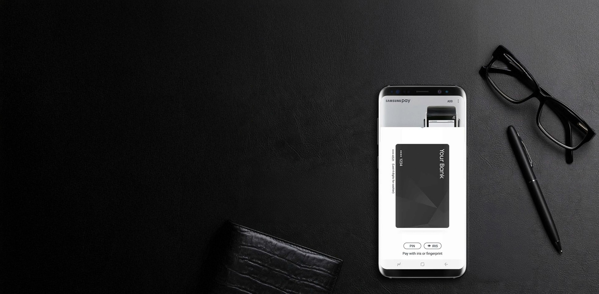
Low visibility of the access point from the payment screen to the Samsung Pay home page led to missed opportunities for user engagement.
In Samsung Pay version 1.0, only ~4% of users navigated to the main page. The access point (a logo-shaped button placed in the top-left corner of the payment screen) was not easily perceived as a gateway to the app's home. As a result, users rarely discovered features like rewards or shopping. Improving this flow was essential to increasing retention and encouraging broader feature exploration.
Design Process
Design Process
We explored, tested, and refined multiple structural concepts to find the most intuitive flow.
Starting with 9 structure variations, we quickly narrowed it down to two key directions through collaborative sketching and low-fidelity prototyping. After testing and feedback sessions from leaderships and PMs, we aligned on two goals: highlight the new shopping feature and simplify the overall layout. The final direction was built on a layered structure — placing the payment screen above the app home layer — which originated from my initial concept.

Final Design
Final Design
The layered structure allowed users to fluidly access the app home, boosting discoverability without disrupting payments.
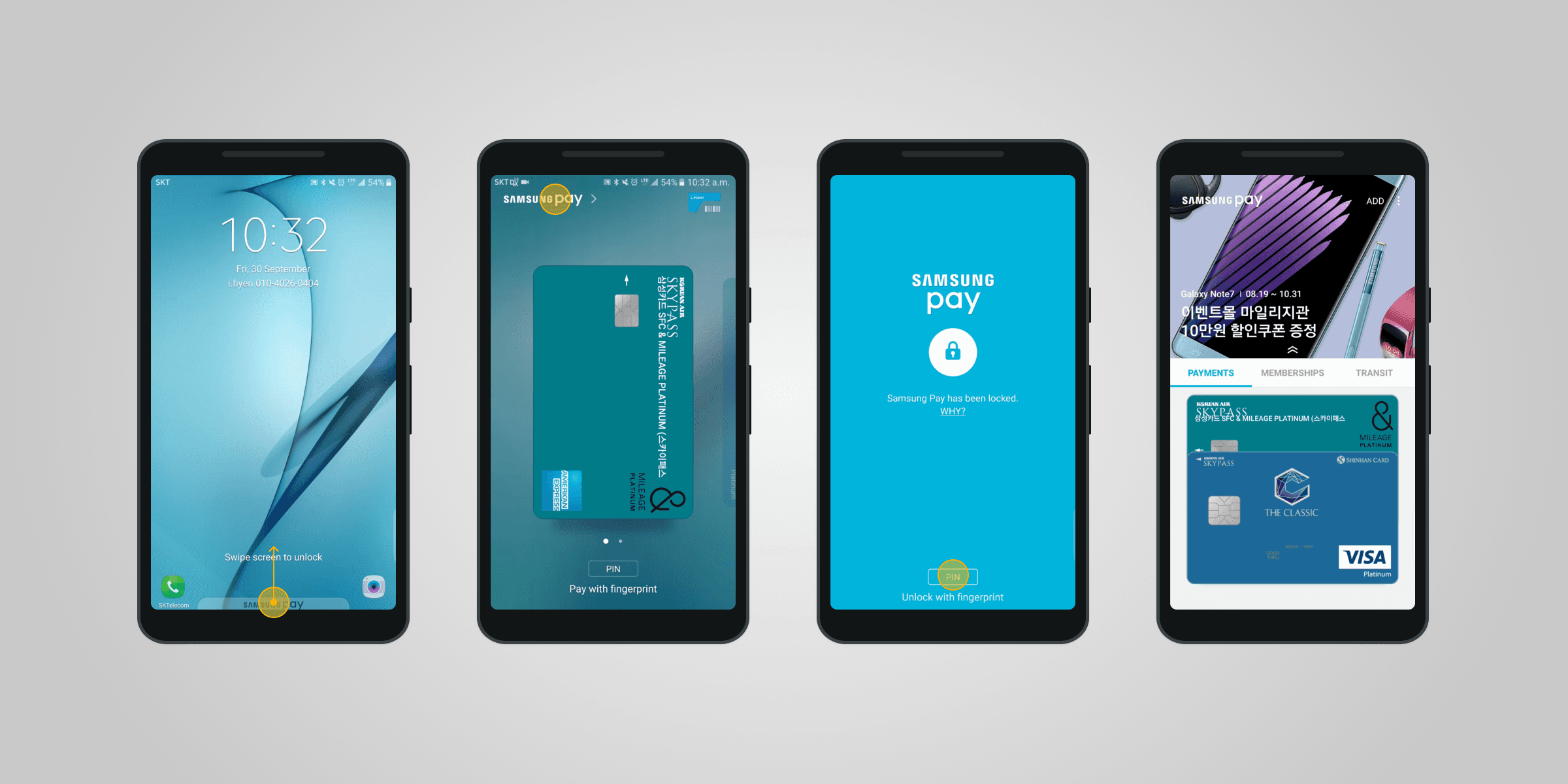
The final design implemented the layered structure I proposed, allowing users to pull down the payment view to reveal the Samsung Pay home. This seamless gesture encouraged exploration of features like rewards, shopping, and promotions. Even with the payment view open, the promotional area beneath remained partially visible-drawing users in with timely, relevant content.
I published design guidelines for this redesign and supported implementation across millions of Galaxy phones globally. I also designed the magazine feature's interaction, visuals, and motion details.
Impact
Impact
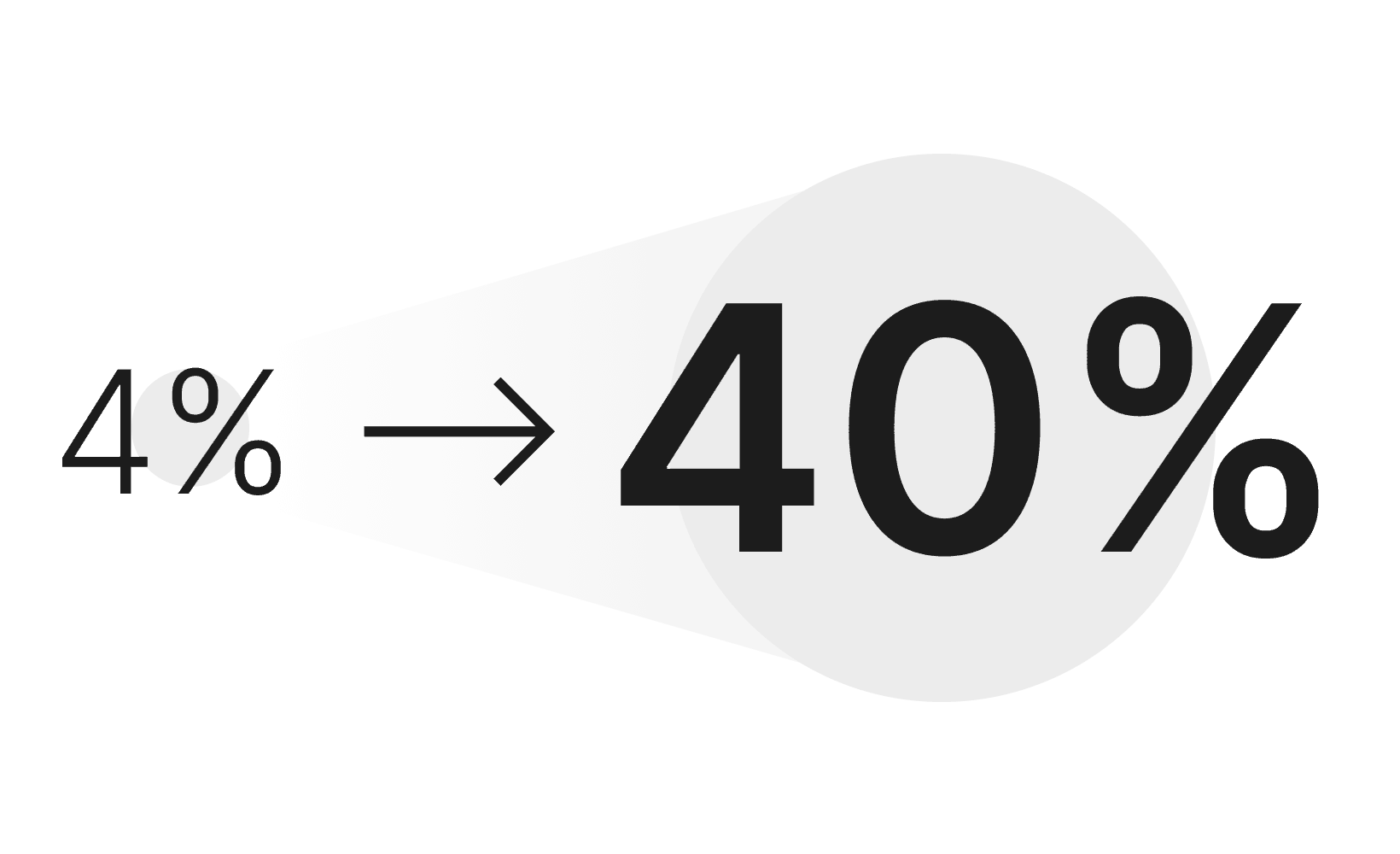
User access to the Samsung Pay home increased tenfold after the redesign.

The redesigned experience was delivered to over 300 million Galaxy phones worldwide.
Lesson learned
Lesson learned
Designing for clarity, focus, and flow had lasting impact on both the product and my design mindset.
User-Centric Navigation and Feature Focus
This project reinforced how intuitive navigation drives engagement. Redesigning the entry point and emphasizing the shopping feature taught me to simplify pathways while prioritizing key content — boosting user retention without overwhelming the experience.
Aligning Through Early Collaboration
Rapid feedback from leaderships and PMs during early prototyping helped align our design vision. Through low-fidelity iterations, I learned the value of cross-functional input in building solutions that meet both user needs and business goals.
Interested in the full story?
I'd love to share more behind-the-scenes insights - feel free to reach out for a deeper dive.
More Works
(NY® — 02)
©2024
More Works
(NY® — 02)
©2024


2016
Fintech
Payment
Interaction and Visual
Samsung Pay Redesign
Discover the evolution of Samsung Pay — where thoughtful layout meets user engagement.
TL;DR
By reimagining Samsung Pay's structure with a layered concept I initiated, we significantly increased user retention and boosted repeat visits to the app.
Responsible for
Redesigned the Samsung Pay interface, using one of my concepts that was chosen to resolve access point challenges and improve the payment structure.
One of four visual designers for the new Samsung Pay.
Tools used
Adobe Photoshop
Adobe Illustrator
Microsoft Powerpoint
Relevant links
Problem
Low visibility of the access point from the payment screen to the Samsung Pay home page led to missed opportunities for user engagement.
In Samsung Pay version 1.0, only ~4% of users navigated to the main page. The access point (a logo-shaped button placed in the top-left corner of the payment screen) was not easily perceived as a gateway to the app's home. As a result, users rarely discovered features like rewards or shopping. Improving this flow was essential to increasing retention and encouraging broader feature exploration.
Design Process
We explored, tested, and refined multiple structural concepts to find the most intuitive flow.
Starting with 9 structure variations, we quickly narrowed it down to two key directions through collaborative sketching and low-fidelity prototyping. After testing and feedback sessions from leaderships and PMs, we aligned on two goals: highlight the new shopping feature and simplify the overall layout. The final direction was built on a layered structure — placing the payment screen above the app home layer — which originated from my initial concept.
Final Design
The layered structure allowed users to fluidly access the app home, boosting discoverability without disrupting payments.
The final design implemented the layered structure I proposed, allowing users to pull down the payment view to reveal the Samsung Pay home. This seamless gesture encouraged exploration of features like rewards, shopping, and promotions. Even with the payment view open, the promotional area beneath remained partially visible-drawing users in with timely, relevant content.
I published design guidelines for this redesign and supported implementation across millions of Galaxy phones globally. I also designed the magazine feature's interaction, visuals, and motion details.
Impact
User access to the Samsung Pay home increased tenfold after the redesign.
The redesigned experience was delivered to over 300 million Galaxy phones worldwide.
Lesson learned
Designing for clarity, focus, and flow had lasting impact on both the product and my design mindset.
User-Centric Navigation and Feature Focus
This project reinforced how intuitive navigation drives engagement. Redesigning the entry point and emphasizing the shopping feature taught me to simplify pathways while prioritizing key content — boosting user retention without overwhelming the experience.
Aligning Through Early Collaboration
Rapid feedback from leaderships and PMs during early prototyping helped align our design vision. Through low-fidelity iterations, I learned the value of cross-functional input in building solutions that meet both user needs and business goals.
Interested in the full story?
I'd love to share more behind-the-scenes insights - feel free to reach out for a deeper dive.
More Works
(NY® — 02)
©2024
2016
Fintech
Payment
Interaction and Visual
Samsung Pay Redesign
Discover the evolution of Samsung Pay — where thoughtful layout meets user engagement.
TL;DR
By reimagining Samsung Pay's structure with a layered concept I initiated, we significantly increased user retention and boosted repeat visits to the app.
Responsible for
Redesigned the Samsung Pay interface, using one of my concepts that was chosen to resolve access point challenges and improve the payment structure.
One of four visual designers for the new Samsung Pay.
Tools used
Adobe Photoshop
Adobe Illustrator
Microsoft Powerpoint
Relevant links
Problem
Low visibility of the access point from the payment screen to the Samsung Pay home page led to missed opportunities for user engagement.
In Samsung Pay version 1.0, only ~4% of users navigated to the main page. The access point (a logo-shaped button placed in the top-left corner of the payment screen) was not easily perceived as a gateway to the app's home. As a result, users rarely discovered features like rewards or shopping. Improving this flow was essential to increasing retention and encouraging broader feature exploration.
Design Process
We explored, tested, and refined multiple structural concepts to find the most intuitive flow.
Starting with 9 structure variations, we quickly narrowed it down to two key directions through collaborative sketching and low-fidelity prototyping. After testing and feedback sessions from leaderships and PMs, we aligned on two goals: highlight the new shopping feature and simplify the overall layout. The final direction was built on a layered structure — placing the payment screen above the app home layer — which originated from my initial concept.
Final Design
The layered structure allowed users to fluidly access the app home, boosting discoverability without disrupting payments.
The final design implemented the layered structure I proposed, allowing users to pull down the payment view to reveal the Samsung Pay home. This seamless gesture encouraged exploration of features like rewards, shopping, and promotions. Even with the payment view open, the promotional area beneath remained partially visible-drawing users in with timely, relevant content.
I published design guidelines for this redesign and supported implementation across millions of Galaxy phones globally. I also designed the magazine feature's interaction, visuals, and motion details.
Impact
User access to the Samsung Pay home increased tenfold after the redesign.
The redesigned experience was delivered to over 300 million Galaxy phones worldwide.
Lesson learned
Designing for clarity, focus, and flow had lasting impact on both the product and my design mindset.
User-Centric Navigation and Feature Focus
This project reinforced how intuitive navigation drives engagement. Redesigning the entry point and emphasizing the shopping feature taught me to simplify pathways while prioritizing key content — boosting user retention without overwhelming the experience.
Aligning Through Early Collaboration
Rapid feedback from leaderships and PMs during early prototyping helped align our design vision. Through low-fidelity iterations, I learned the value of cross-functional input in building solutions that meet both user needs and business goals.
Interested in the full story?
I'd love to share more behind-the-scenes insights - feel free to reach out for a deeper dive.
More Works
©2024